Sensemaking using Elements
The research foundation story
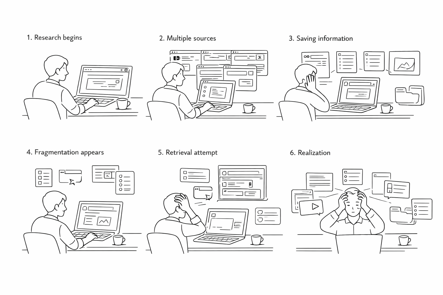
What Researchers and content creators can collect information endlessly, but turning that pile into an original idea is where they get stuck. The tools they use are designed for storage, not for thinking.
Why In our 8-month capstone with Prof. Niki Kittur, we studied how creators actually synthesize — observed their workarounds, mapped their breakdowns — and found that the friction between collection and creation is where the most time is lost.
How An Electron app that bridges collection and creation: an infinite spatial canvas for clipping, organizing, annotating, and synthesizing across media types. I led prototyping on a 6-person team, from needfinding through cognitive walkthroughs.
Background
What is a Capstone Project?
The CMU Master of Human-Computer Interaction program culminates in an eight-month Capstone, the longest sustained project in the curriculum. Teams are matched with real clients from industry or academia, given a domain with no pre-defined problem statement, and expected to deliver a validated, working prototype by the end of the academic year. The cycle runs needfinding and research in the fall, synthesis and ideation through winter, and prototyping and evaluation in the spring. I led the full-stack engineering effort and contributed across research, interaction design, and prototyping for the full duration of the project.
Who is the Client?
My team of six was matched with The Knowledge Accelerator Project, Professor Niki Kittur's research program at CMU, backed by the NSF, NIH, Google, and Microsoft. His lab had spent a decade studying how people make sense of information online. One output was Fuse: a Chrome extension that helped academic researchers collect and clip sources more effectively than a folder of bookmarks. Our mandate was to ask the harder question: what happens after collection? How do people move from a pile of saved sources to something coherent and shareable? And who else, beyond academic researchers, needs a tool that supports that entire journey?
What is Sensemaking?
Sensemaking is the process of turning a flood of raw information into something you can act on. You collect fragments (articles, videos, notes, links) and through repeated passes you start to see structure: themes emerge, contradictions surface, a coherent picture forms. The output isn't just understanding; it's an artifact you can share. Researchers do it. Journalists do it. So do content creators building a YouTube essay from 40 browser tabs.
while(knowledge_exists)
  <repeat new-context>
    // Collect information
    // Summarize information
    // Create Artifact (maybe)
</repeat>Needfinding
Who are we designing for?
Eight months begins with not knowing. We opened with a broad hypothesis (that online shoppers might benefit from a sensemaking tool) and ran directed storytelling sessions with 11 participants, 249 survey responses, and a literature review across 12 papers. The data deflated the hypothesis quickly. Most pre-purchase research is shallow enough that a browser tab and a gut feeling are sufficient.
What did the data surface instead?
A behavioral outlier. People research very differently when the topic is something they're passionate about and plan to share. The depth, the cross-referencing, the sustained effort across weeks: categorically different behavior. That observation pivoted us to online content creators: YouTubers, bloggers, and Instagram educators who treat thorough research as a baseline expectation of their work.
What did creators tell us?
We ran 20+ speed-dating sessions to pressure-test the direction, then 10+ in-depth interviews with research-heavy creators. Three frustrations came back consistently:
- Pain Point 1I need to keep track of fragmented information and retrieve them later on.
- Pain Point 2It is hard to translate my knowledge into more meaningful output.
- Pain Point 3It is troublesome to adapt the same information into different formats.
Research Synthesis
How do creators actually work?
From the research, we mapped the creator workflow onto four stages that no single existing tool supported end to end. These weren't design decisions. They were findings about how content creation actually works.
- AggregationDump clips from multiple sources (YouTube, Reddit, academic PDFs, social posts, news) into a single collection space. By the time creators sit down to write, sources are scattered across five apps.
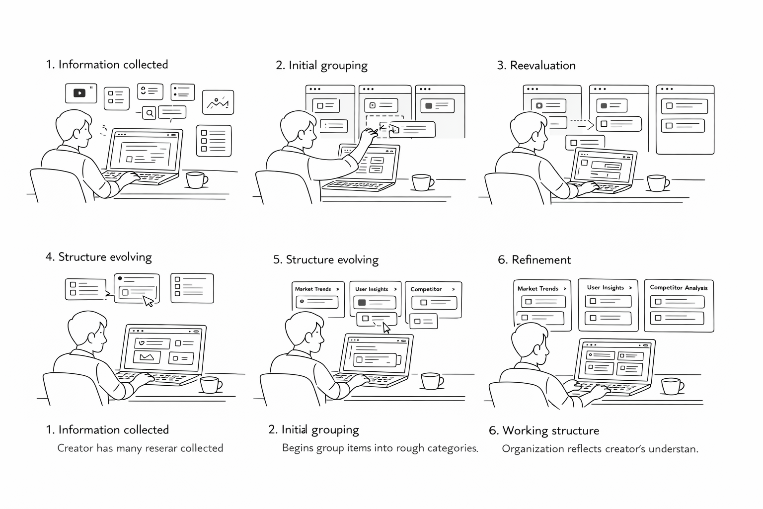
- OrganizationPush collected clips into buckets based on an organizing principle. Most tools offer one level of structure. A creator building a long-form research piece needs groupings that evolve as the argument develops.
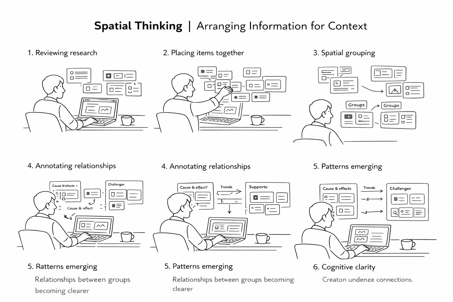
- ContextualizationGroup clips on a shared board and look at them together. Annotation is only valuable at the moment of capture. The note explaining why a source matters, written two weeks later, is the note that never gets written.
- SynthesisDerive understanding by capturing notes across groups. The heavy lifting is cognitive: holding multiple ideas in working memory and finding the thread that connects them. Seeing everything spatially, at once, made connections easier to find.
What constraints did this set?
The four stages pointed to three design principles that constrained every decision that followed:
- Tight integrationThe tool must work within existing platforms and workflows, not ask creators to adopt a new system from scratch.
- Effortless transitionMoving between clipping and organizing must feel continuous, not a mode switch. Context loss between those states is where most existing tools break down.
- Mental model alignmentCreators visualize their information spatially, in loose piles that consolidate over time. The interface must match that model, not impose a hierarchy on top of it.
Storyboarding
With the four-stage model from Research Synthesis, we needed to verify that it reflected how creators actually experienced their work, not just how they described it in interviews. We built four storyboards, one per stage, and ran them through speed-dating sessions with content creators. The goal was validation, not ideation: did the scenarios land?

Solution Design
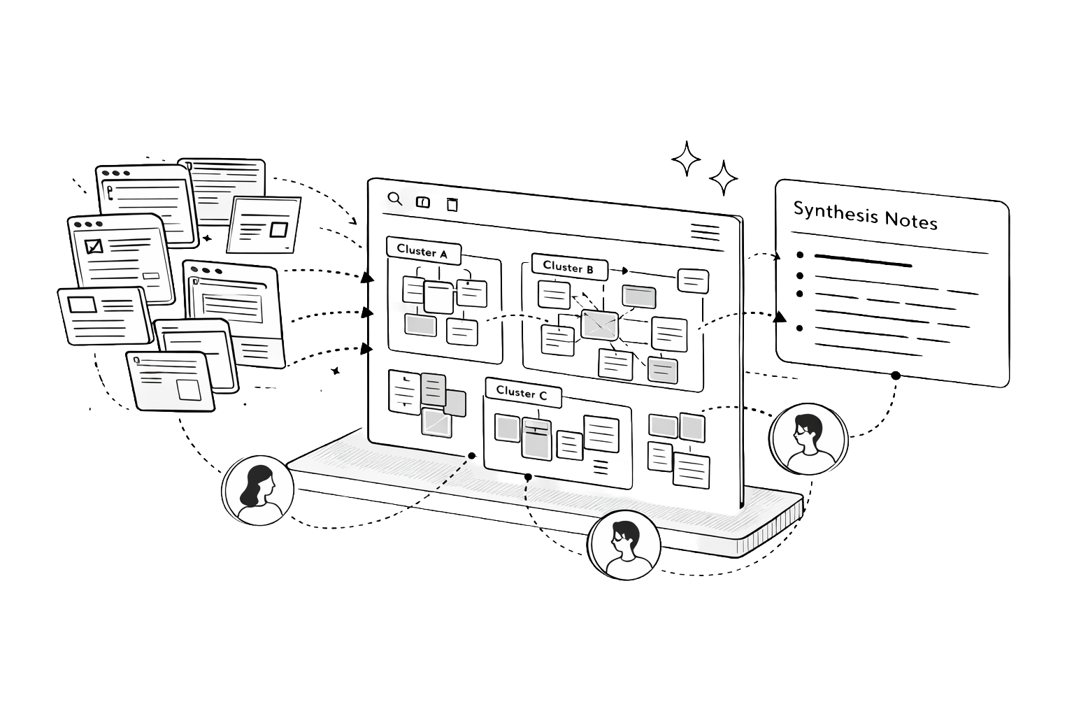
The four stages from Research Synthesis weren't just a workflow model. They became the four pillars of the design solution. Each pillar maps directly to a capability the tool had to deliver. Together they define what it means to support sensemaking end to end.
Collection Dump for Aggregation

Creators told us research fragments across five apps before they write a single sentence. The collection space solves this by letting them dump clips from any source (video, article, social post, PDF) without leaving their browser. Each clip is media-adaptive so a YouTube frame and a highlighted excerpt never look the same at a glance. A media-type filter supports the way creators actually retrieve: by format first, then content.
Buckets for Organization
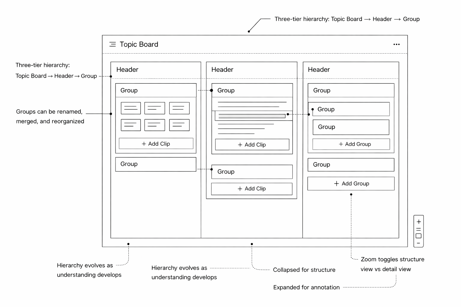
Creators don't organize once. They reorganize three times before anything gets written. The board uses a three-tier structure (Topic Board → Headers → Groups) that matches how thinking naturally clusters outward. Groups can be renamed, merged, and restructured freely. Zoom acts as a fidelity toggle: collapsed for structure, expanded for annotation. The hierarchy accommodates how understanding evolves, not how it starts.
Board for Contextualization

Placing related clips spatially is itself an act of meaning-making, something creators were doing with sticky notes and whiteboards before we built this. The infinite canvas makes that instinct native to the tool. Clip-level annotations anchor context at the moment of capture, when it matters. Group annotations surface the emerging argument a cluster is building, visible without opening a single clip.
Annotations for Synthesis

The hardest part of research isn't finding information. It's holding multiple ideas in working memory long enough to find the thread connecting them. A unified annotation layer across three surfaces (notepad, clip notes, group notes) makes that cognitive work persistent and visible. Stepping back to see the whole board at once is when insight emerges. Group annotations pull into a structured outline with one click, turning spatial understanding into a draft.
Prototyping
One of the early architectural decisions was platform: web app versus native desktop. The board interactions we'd designed (drag and drop, infinite canvas, resizing, real-time annotation) needed a native feel, so we chose ElectronJS, which gave us a desktop application wrapper without abandoning the JavaScript ecosystem the team already knew.
- StackElectronJS · TypeScript · React · React Redux · Express · lowdb → MongoDB Atlas
Before building the full prototype, I built five focused proof-of-concept modules to validate the riskiest interactions in isolation before integrating them. Building the POCs separately surfaced interaction conflicts early, most notably between the drag-and-drop system and the resizable annotation layer, which had competing pointer event handlers — resolving that at the POC stage was significantly less expensive than resolving it mid-integration.
- Sticky NotesThe base unit of the annotation layer, used to test z-order, edit state, and persistence.
- GroupingContainer logic for grouping clips on the board, including nested hierarchy.
- Drag and DropThe primary interaction model across the entire board surface.
- Annotations & ResizingClip-level annotation states and freeform resize behavior.
- StorageLocal persistence with lowdb bridging to MongoDB Atlas for sync.
Evaluation
We conducted cognitive walkthroughs with 4 content creators on the high-fidelity prototype using think-aloud methodology. Every session resulted in removing at least one tool from the creator's existing stack, typically Google Docs or Apple Notes, which had been serving as a parallel annotation layer. The clip collection tested as more organized and navigable than browser tabs and link lists, and the board hierarchy accommodated three of four creators' content structures without modification. The one failure mode we identified was that creators who had already accumulated 60+ clips with no organizing logic found the board overwhelming to initialize — first-use onboarding with existing material is a problem the prototype didn't solve, a gap that sits at the seam between desirability and sustained utility.
- Beta UserBeing able to see every piece of content that's collected easily — that's really cool!
- Beta UserI've never really thought about using a format like the infinite canvas before because I've never seen it done this easily. I want to use this right now!
- Beta UserI think this tool allows you to cut down on the amount of time you actually spend writing because you can go back and refer to your notes.
Reflection
The prototype had no real Fuse integration and no persistent backend at evaluation time — everything was tested with seeded content in a controlled session, not across weeks of real use. The design is desirable, but whether it's useful under actual workload required a longitudinal study we didn't have time to run: a multi-week diary study with active creators through a full research-to-publish cycle, and a targeted usability pass on the onboarding moment. Even so, two things carried forward clearly: the value of staying deliberately divergent through parallel designs, even under timeline pressure, and the POC-first engineering discipline of building isolated proof-of-concepts for risky interactions before integration — a habit I've brought into every complex frontend project since.